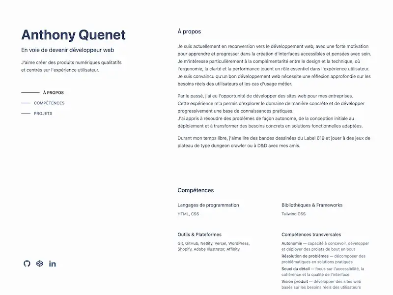
Context & Objective
This website was built to present my work and professional background as I transition into web development. The objective was straightforward: a clean, accessible portfolio that works well and reflects a serious approach to front-end craft.
It was also an opportunity to learn Tailwind CSS in a real project context, and to structure JavaScript across multiple components for the first time in a utility-first workflow.
What's in the project
Sticky sidebar layout
On desktop, the left column stays fixed while the right scrolls. This layout pattern required understanding how position: sticky interacts with flex containers and viewport height constraints.
Scroll-based navigation
The nav highlights the active section as you scroll. This is handled by a dedicated nav.js component using the Intersection Observer API.
Reveal animations
Sections animate in as they enter the viewport. The effect is handled by animation.js, also using the Intersection Observer API, with prefers-reduced-motion support via Tailwind's motion-reduce utilities.
Contact form
The contact section uses a custom serverless function in api/contact.js deployed on Vercel, with a honeypot field for spam protection. Form state and user feedback are handled in form.js.
Tailwind CSS build pipeline
Styles are compiled from src/input.css to src/output.css via the Tailwind CLI, configured through package.json. This was the first project where I worked with a front-end build step outside of a full framework.
Technical stack
Frontend
- HTML Semantic markup, full SEO metadata, Open Graph, favicons, webmanifest
- Tailwind CSS Utility-first styling compiled via Tailwind CLI, with responsive and motion-reduce variants
- Vanilla JavaScript Three modular components: scroll-based nav highlighting, reveal animations, and contact form handling
Deploy
- Vercel Hosting with continuous deployment from GitHub, custom domain, and serverless function for the contact form
- Git & GitHub Version control throughout the development process
Challenges & Learnings
Learning Tailwind CSS on a real project
Adopting a utility-first framework changes how you think about styling. Rather than writing named classes and attaching properties to them, you compose styles directly in the markup. Applying this on a project with a specific design intent made the tradeoffs concrete and easier to evaluate.
Using the Intersection Observer API
Both the nav highlighting and the reveal animations rely on the Intersection Observer API. Understanding how to configure thresholds, manage observed elements, and unobserve after triggering required reading the documentation carefully and testing against real scroll behaviour.
Serverless functions and form handling
Replacing Netlify Forms with a Vercel serverless function meant handling the full form submission flow in JavaScript: reading the request body, validating input, and returning appropriate responses. This introduced the concept of server-side logic within a static deployment context.