Context & Objective
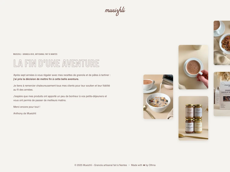
When I decided to close Mueizhli, the brand's domain was still receiving visits from loyal customers. Rather than letting them land on a dead page or an empty Shopify store, I wanted to give them a proper goodbye — something that matched the brand's identity and explained the closure honestly.
This was the first project I built entirely from scratch, without a CMS or platform to lean on. HTML, CSS, Vercel — nothing else. Writing every line myself, from the <head> metadata to the image loading strategy, was a deliberate choice to consolidate what I had been learning.
What's in the code
The page is intentionally minimal — a single HTML file and a CSS stylesheet. But minimal doesn't mean careless.
Brand identity
The SVG logo was embedded inline in the HTML — keeping it sharp at any resolution without an extra network request. Typography, spacing and colours match the original Mueizhli brand.
Image grid layout
The hero section uses a three-column staggered image grid — offset vertically per column to create visual rhythm. Built with custom CSS, no framework.
Image optimisation
The hero image uses fetchpriority="high" and is preloaded via a <link rel="preload"> in the <head>. Below-fold images use loading="lazy". All images are served as .webp.
SEO & metadata
Full Open Graph and Twitter Card tags, a manifest.webmanifest, canonical URL and favicons for all common device sizes.
Technical stack
Frontend
- HTML Semantic markup, full SEO metadata, inline SVG logo, image loading strategy
- CSS Custom stylesheet — staggered image grid, responsive layout, brand-consistent typography and spacing
Deploy
- Vercel Deployed from GitHub, connected to the custom domain mueizhli.com
- Git & GitHub Version control — source code is publicly available
Challenges & Learnings
Building without a safety net
No CMS, no framework, no theme to fall back on. Every structural decision — how to organise the CSS, how to handle the image grid, where to put what — had to be made consciously. That constraint turned a small project into a real exercise in understanding how the web actually works.
Responsive design from scratch
Getting the staggered image grid to hold up across screen sizes without a utility framework meant writing proper media queries and understanding how layouts break — and how to prevent it.
Caring about performance details
Thinking about which image loads first, when to defer others, how to serve the right format — understanding these concepts on paper is one thing, but applying them on a real page with real images is what made them actually stick.